All work 02 / 04 · Health · Nutrition · Mobile app

TPNL

The Prenatal Nutrition Library

An app that starts from where you are, not from where the content is filed.

A subscription app that helps people eat well from preconception through pregnancy, postpartum and lactation, without Googling every ingredient first. The rebuild changed how the app is organised: from a content library to an experience built around the person’s stage and week.

Role
Product designer · information architecture, interaction design and UI for every screen of the rebuild
Timeline
3–4 months
Team
The founder, a registered dietitian, as product owner · a product manager, who did design review · the development team, who built it
Platforms
iOS · Android
Shipped
Version 3.0, App Store, 28 August 2025

App Store (opens in a new tab) Google Play (opens in a new tab)

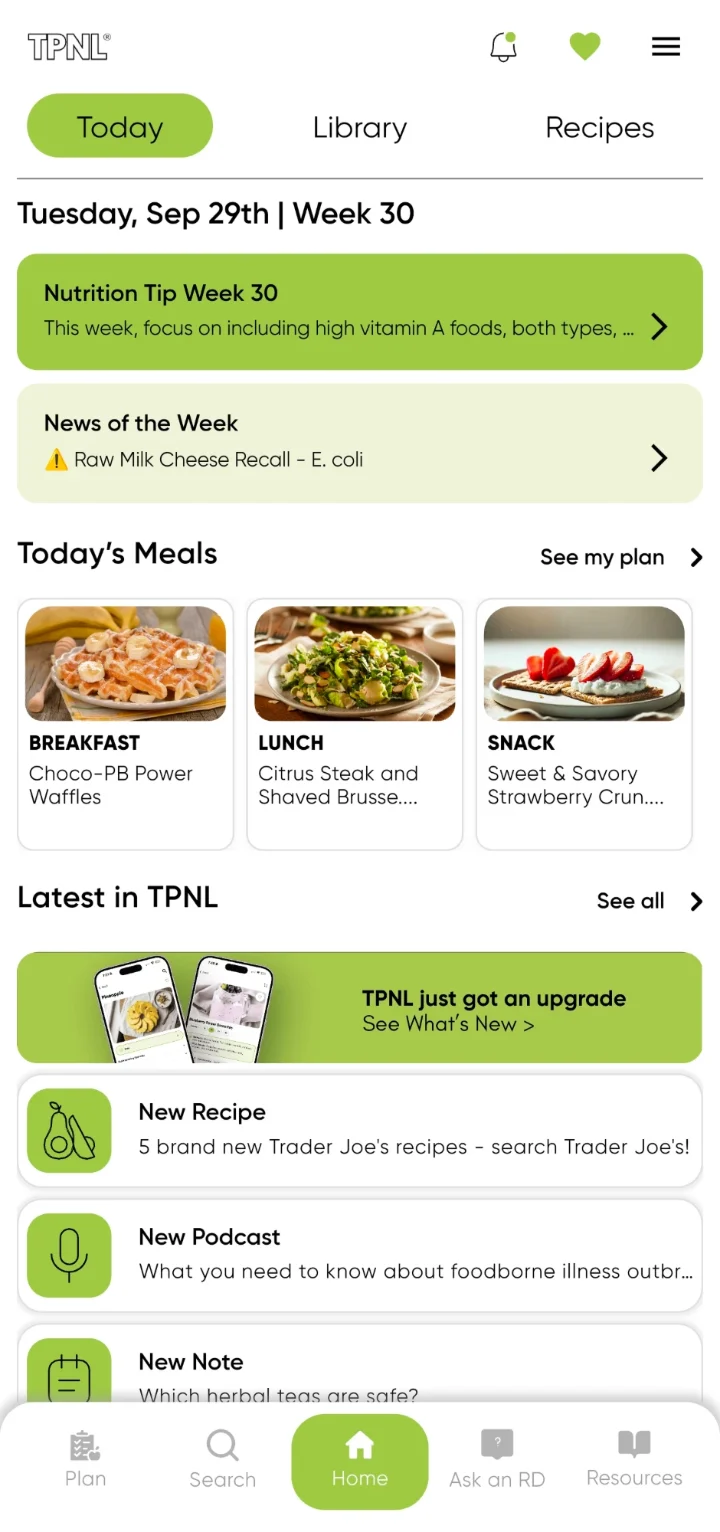
TPNL Today screen for Tuesday, 29 September, Week 30: the Nutrition Tip for Week 30; News of the Week reporting a raw milk cheese recall; today's meals, Choco-PB Power Waffles, Citrus Steak and Shaved Brussels Sprouts Salad, and Sweet & Savory Strawberry Crunch; and what's new in the app.

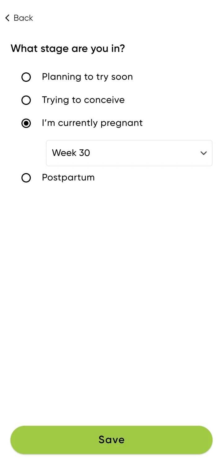
The app’s stage picker

  1. Planning to try soon
  2. Trying to conceive
  3. I’m currently pregnantThen the week, e.g. Week 30
  4. PostpartumCovers lactation, which also has its own place in Learn by Stage
  1. My roleProduct designer: I turned the founder’s product vision into the full app design.
  2. ProblemThe old app organised answers by where they were stored, not by what someone needed.
  3. ApproachReorganise the app around the person’s stage and week.
  4. Outcomev3.0 shipped; rated 4.6 overall from 215 ratings.
Jump to decisions

01 · The problem

Every meal came with a question: is this safe, at this stage, for me and the baby?

People trying to conceive, pregnant or recently postpartum worry about what’s safe and healthy to eat. So they Google, ingredient by ingredient, and what they find hasn’t been checked by a dietitian. Food becomes a source of stress.

The old app already held a dietitian’s answers. But it organised them by where they were stored, not by what someone needed at that moment. That made it a product problem, not a screen problem.

My role

I owned the design, from information architecture through interaction design to final UI, working directly with the founder, who was the product owner and is a registered dietitian.

How I approached it

Evidence base: customer input from the founder’s practice, the founder’s expertise as a registered dietitian, a review of comparable health and nutrition products, and the existing app. I framed each decision as a hypothesis to test.

For each decision I asked four questions:

  1. What is the person trying to do?
  2. What decision are they making?
  3. What do they need to know at that moment?
  4. What can be removed so it takes less effort?

02 · The app before

A library you had to learn before you could use it.

The old app presented the founder’s content the way it was stored: as a library. The structure asked people to know what kind of content held their answer before they could look for it.

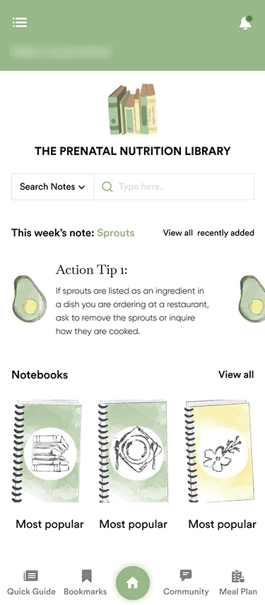
The old app’s home screen: the library illustration, a Search Notes menu beside the search field, This week's note: Sprouts, a row of notebooks, and a bottom bar with Quick Guide, Bookmarks, Home, Community and Meal Plan. The greeting is blurred.
Home, old app
  1. Search began by choosing a content type: Search Notes.
  2. One weekly note for everyone: This week’s note: Sprouts.
  3. The bottom bar: Quick Guide, Bookmarks, Community and Meal Plan.
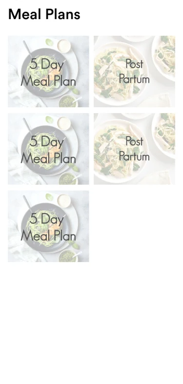
The old app’s Meal Plans screen: a grid of image tiles, three labelled 5 Day Meal Plan and two labelled Post Partum.
Meal Plans, old app
  1. Meal plans were a gallery of fixed plans: 5 Day Meal Plan, Post Partum.
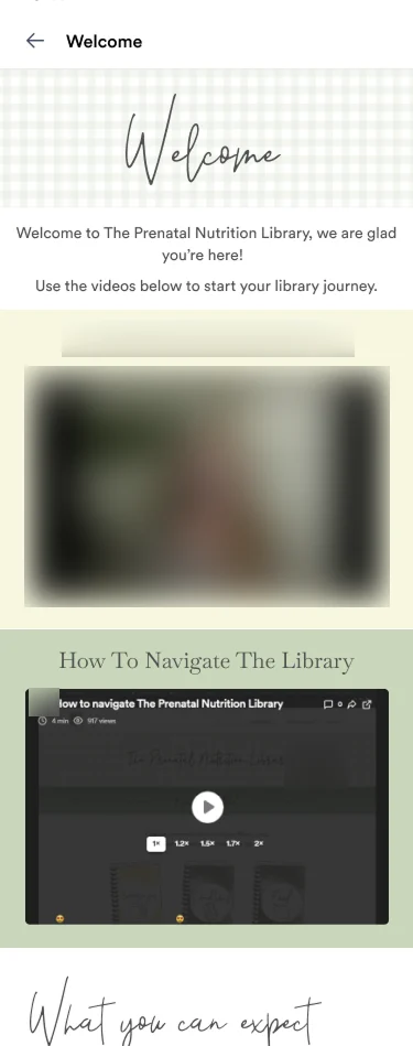
The old app’s welcome screen: a welcome message asking people to use the videos below to start their library journey, then two videos: a welcome from the founder, and How To Navigate The Library. The founder’s name and face are blurred.
Welcome, old app
  1. The welcome page relied on two videos, one of them How To Navigate The Library.
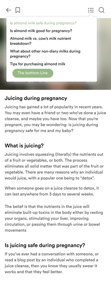
The old app’s article screen: an open contents menu listing questions about almond milk in pregnancy, above a long article about juicing during pregnancy. The photo behind the menu is blurred.
Article, old app
  1. Answers sat inside long articles, reached through each article’s own contents menu.

03 · What made it hard

A large library, very different stages, and health at stake.

The founder already had a large body of expert content on the TPNL website. All of it had to come into one app, without overwhelming the person using it.

  • Notes
  • Guides
  • Courses
  • Podcasts
  • 600+ recipes
  • Everything, without overwhelmNotes, guides, courses, podcasts and hundreds of recipes in one app, without burying the one answer someone needs.
  • Very different stagesTrying to conceive, each trimester, postpartum and lactation each ask something different of food.
  • Health content, handled responsiblyExpert-backed, and clear about what an app can’t advise on for one person.
  • Quick answers and whole weeksSome people want to know whether they can eat something now; others want to plan the whole week.

The hardest part

The hardest part wasn’t designing the screens. It was working out, with the founder, how much personalisation the product should offer, without overwhelming people or implying it could replace professional nutrition advice.

That question runs through the information architecture, search, dietary preferences, the recipe screen, the line between community and expert content, and nutrition services.

04 · The shift

From how the content is filed to where you are.

The stage chosen at onboarding, down to the week of pregnancy, now drives the app: Today, the nutrition tip, meal plans, recipes and Learn by Stage.

The old app · organised by content type

The library

  • Notes, searched by type
  • Notebooks
  • Quick Guide
  • Bookmarks
  • Community
  • Meal Plan

You chose where to look first.

The rebuild · organised by stage

Your stage and week

  • Today
  • Nutrition tip
  • Meal plans
  • Recipes
  • Learn by Stage

Everything below follows from the stage and week.

The old app was organised by content type, so people chose where to look first. The rebuild is organised by the stage and week, which drives Today, the nutrition tip, meal plans, recipes and Learn by Stage.
Problem
The old app asked people to pick a content type before searching, and gave everyone the same weekly note.
Context
Pregnancy keeps changing. What’s safe and useful to eat depends on the stage and the week.
Hypothesis
An app that starts from where someone is will serve them better than a library they have to search.
Brief
Set by the founder: the stage and week drive the whole app.
My design
I made the stage a choice at onboarding, easy to change later, and carried it through every screen.
Trade-off
People have to enter their pregnancy details before they can browse recipes.

One setting, carried throughWeek 30

Stage picker: What stage are you in? Planning to try soon, Trying to conceive, I'm currently pregnant with Week 30 selected, and Postpartum, with a Save button.
Stage pickerChosen at onboarding; the meal plans keep a Change My Stage button one tap away.
TPNL Today screen for Tuesday, 29 September, Week 30: the Nutrition Tip for Week 30; News of the Week reporting a raw milk cheese recall; today's meals, Choco-PB Power Waffles, Citrus Steak and Shaved Brussels Sprouts Salad, and Sweet & Savory Strawberry Crunch; and what's new in the app.
TodayThe nutrition tip is written for week 30.
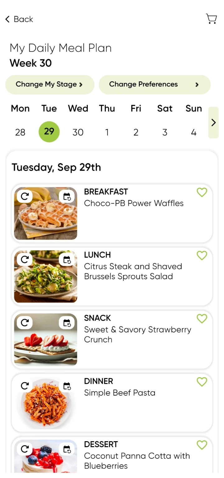
My Daily Meal Plan for Week 30, Tuesday 29 September: breakfast, Choco-PB Power Waffles; lunch, Citrus Steak and Shaved Brussels Sprouts Salad; snack, Sweet & Savory Strawberry Crunch; dinner, Simple Beef Pasta; dessert, Coconut Panna Cotta with Blueberries. Every meal has swap and reschedule controls.
Daily meal planThe plan is built for week 30, too.

Where things live.

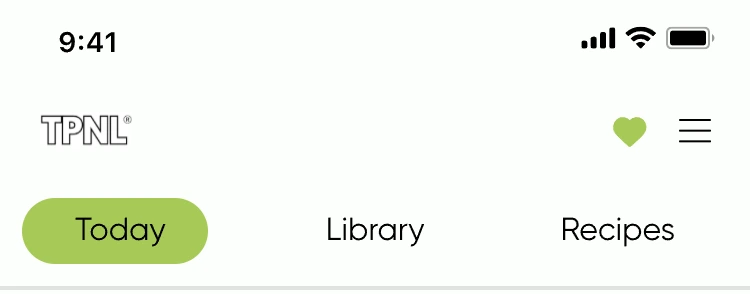
The bottom bar holds the main sections. Home holds three tabs: Today, Library and Recipes. The menu holds Table of contents, Favorites, Topic suggestion, Nutrition services, Profile and Logout.

05 · Decisions

Four decisions, each on a screen.

The founder set what the app should do. I decided how each idea works on screen, and what each screen asks of the person. Each one answers the same question from a different side: what should I eat, right now, at this stage?

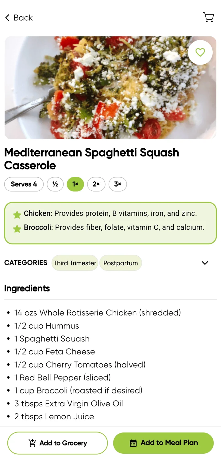
Recipe detail for Mediterranean Spaghetti Squash Casserole: a serving scaler set to 1x with half, 2x and 3x options; a highlighted box saying chicken provides protein, B vitamins, iron and zinc, and broccoli provides fiber, folate, vitamin C and calcium; categories Third Trimester and Postpartum; the ingredient list; and Add to Grocery and Add to Meal Plan buttons.

Decision 01

The recipe as a decision tool

Problem
A recipe tells you how to cook something, not whether it’s right for you now.
Hypothesis
A recipe can support several decisions at once: is this for me, is it right for my stage, how much do I need, what do I buy, and do I want it in my plan.
Brief
Set by the founder: recipes should show why they suit your stage.
My design
I placed the why-it’s-good box above the ingredients and fixed the two actions at the bottom.
Why
The question people bring is about their stage. The recipe answers it before the ingredient list starts.
Trade-off
Some visual simplicity. The screen is more information-dense than a recipe on its own, but people can decide and take the next step without leaving it.
On the screen
  • A highlighted box on why key ingredients matter
  • Stage categories: Third Trimester, Postpartum
  • A serving scaler: ½, 1×, 2×, 3×
  • Two actions: Add to Grocery, Add to Meal Plan
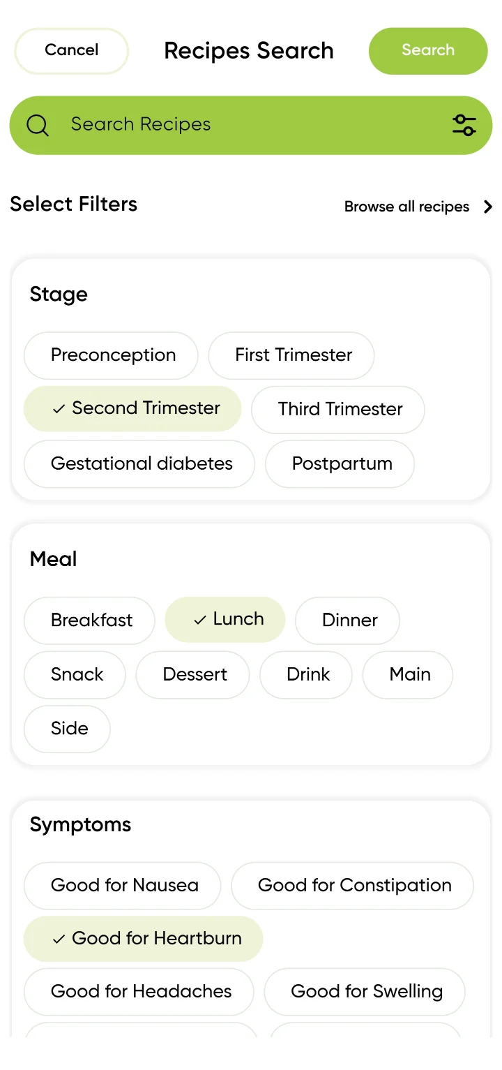
Recipes Search filter panel: Stage filters (Preconception, First, Second and Third Trimester, Gestational diabetes, Postpartum) with Second Trimester selected; Meal filters with Lunch selected; and Symptoms filters: Good for Nausea, Constipation, Heartburn (selected), Headaches and Swelling.
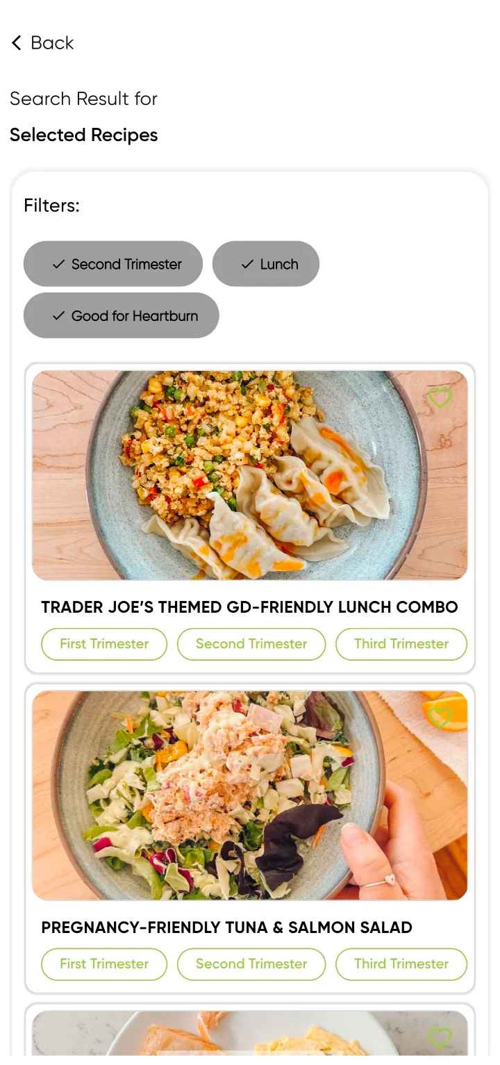
Recipe search results for the filters Second Trimester, Lunch and Good for Heartburn: a Trader Joe's themed GD-friendly lunch combo and a pregnancy-friendly tuna and salmon salad, each tagged with the trimesters it suits.

Decision 02

Search by how you feel and what you need

Problem
Searching by dish name only helps if you already know what to cook.
Hypothesis
People may not know the name of the recipe they want, but they know their stage, the meal they need and how they feel.
Brief
Set by the founder: search by stage, meal and symptom.
My design
I grouped the filters by stage, meal and symptom as chips, and kept the chosen filters visible on the results.
Why
It lets search start from what someone already knows about their situation.
Trade-off
Some of the simplicity of a plain search box. More controls, in exchange for starting from how someone feels instead of needing to know the recipe.
The filters
  • Stage, including gestational diabetes
  • Meal, from breakfast to sides
  • Symptoms: Good for Nausea, Constipation, Heartburn, Headaches, Swelling
  • The results keep the chosen filters in view: Second Trimester, Lunch, Good for Heartburn
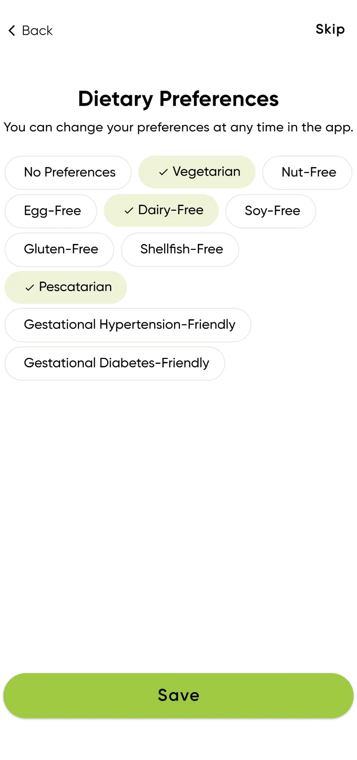
Dietary Preferences: No Preferences, Vegetarian, Nut-Free, Egg-Free, Dairy-Free, Soy-Free, Gluten-Free, Shellfish-Free, Pescatarian, Gestational Hypertension-Friendly and Gestational Diabetes-Friendly, with Vegetarian, Dairy-Free and Pescatarian selected. A line says preferences can be changed at any time.
Three chosenUp to three preferences, no warning.
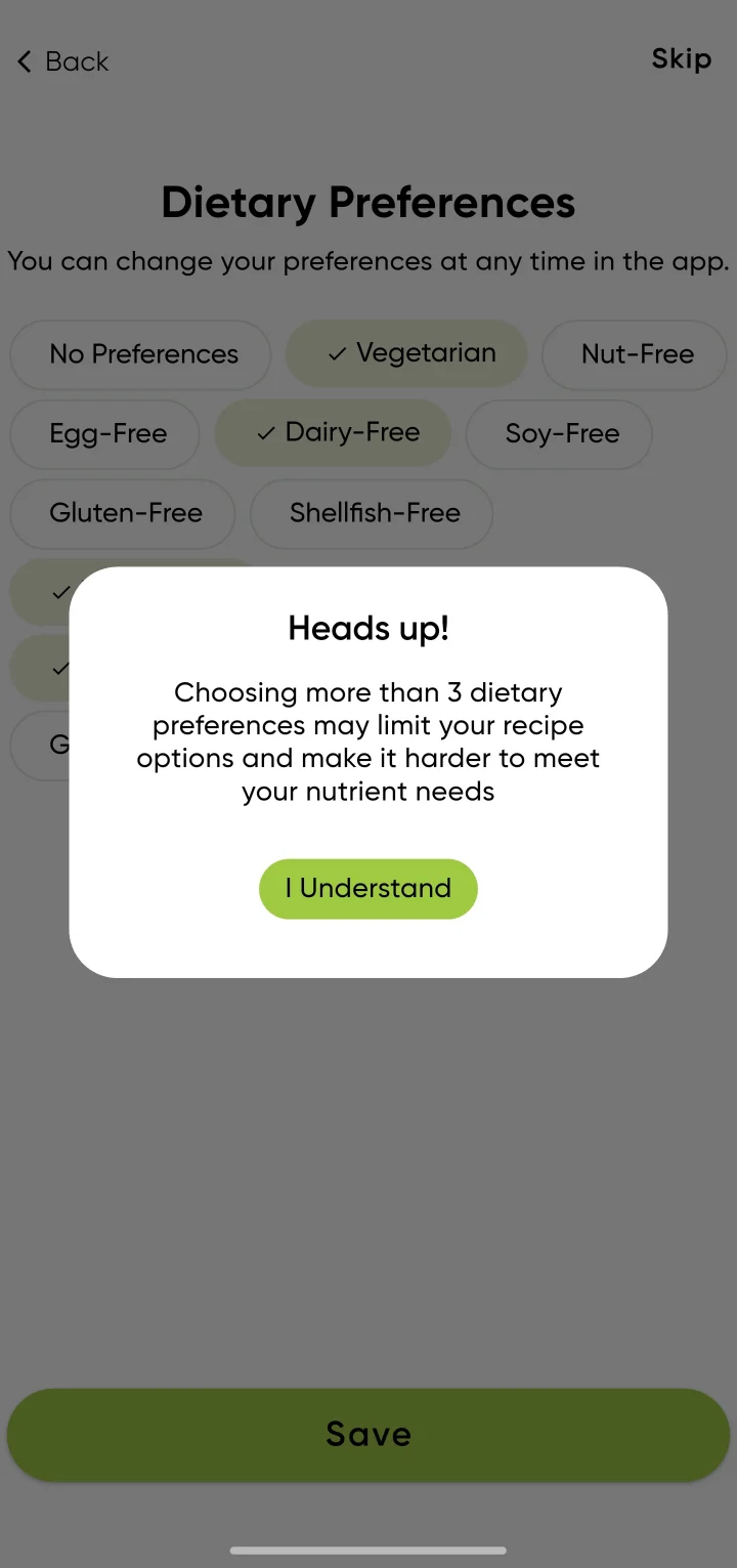
Heads up! dialog over the dietary preferences: choosing more than 3 dietary preferences may limit your recipe options and make it harder to meet your nutrient needs, with an I Understand button.
Tapping a fourthThe warning appears; after “I Understand”, the fourth is selected.

Decision 03

Guardrails inside personalisation

Problem
Every dietary restriction makes nutrient needs harder to meet.
Hypothesis
Explaining the consequence will inform people better than a hard limit, without taking the choice away.
Brief
Set by the founder: warn when too many dietary restrictions are chosen.
My design
I designed a warning instead of a block, shown when a fourth preference is tapped.
Why
Preferences are personal. The app’s job is to flag the nutrition risk, not to overrule the choice.
Trade-off
People can still choose more preferences than are good for them. The warning informs the choice; it doesn’t prevent it.
In the preference picker
  • Tapping a fourth dietary preference brings up “Heads up!”: more than 3 may limit recipe options and make nutrient needs harder to meet
  • After “I Understand”, the fourth is selected: the app warns, it doesn’t block
  • Preferences can be changed at any time
  • “No preferences” turns the other options off
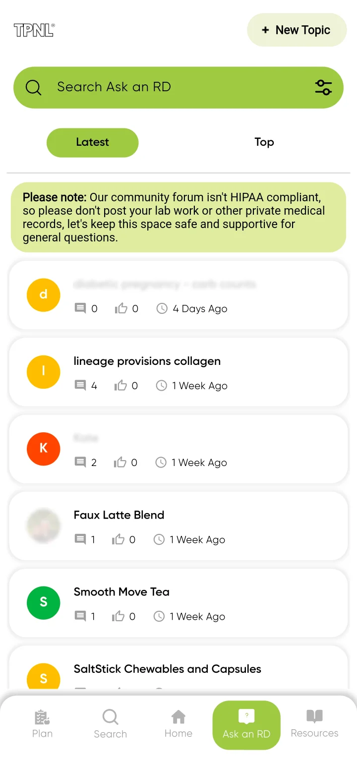
Ask an RD forum: a search field, Latest and Top tabs, and a note that the community forum isn't HIPAA compliant, so people shouldn't post lab work or other private medical records. Some topic titles and a profile photo are blurred.
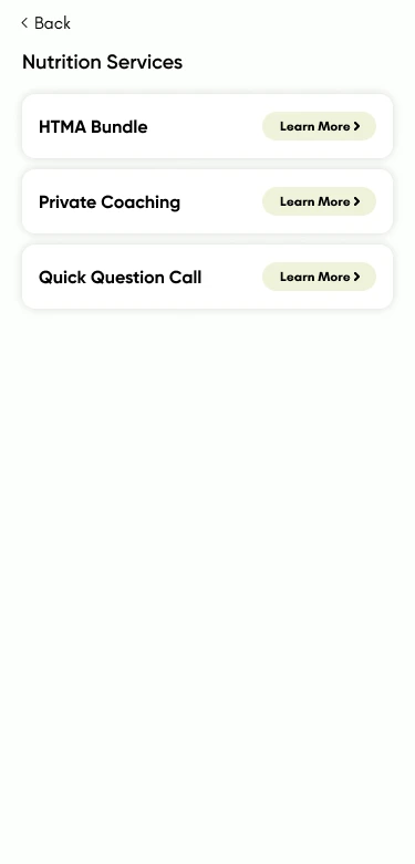
Nutrition Services screen: three services, HTMA Bundle, Private Coaching and Quick Question Call, each with a Learn More button.

Decision 04

Clear about where advice ends

Problem
Health questions invite personal answers that an app shouldn’t give.
Hypothesis
Community discussion and professional help serve different needs, and people should always know which one they are in.
Brief
Set by the founder: be clear about what the app can’t advise on.
My design
I placed the HIPAA note at the top of the forum, above every topic.
Why
Expert content stays trustworthy when its limits are stated.
Trade-off
Some simplicity: the note adds text to the forum, and Nutrition services is an extra step away. In return, community discussion and professional nutrition help stay clearly apart.
Where it shows
  • Ask an RD is a community forum for general questions. A note says it isn’t HIPAA compliant, so people shouldn’t post lab work or medical records
  • Nutrition services is a separate, professional path, reached from the menu: HTMA Bundle, Private Coaching and Quick Question Call

06 · Options set aside

What I tried before the plans shipped.

Not every design exploration became a shipped feature. Two parts of the meal plans went through earlier versions, and one feature was dropped altogether. Each screen is shown as designed, with why it changed.

Swapping a meal

Every meal in the daily plan can be swapped for another.

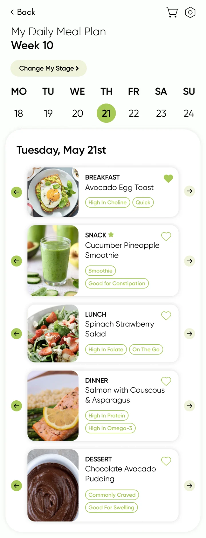
Rejected daily meal plan design: each meal card has a round arrow button on its left and right to swap the meal.
RejectedArrows beside each cardIt took a lot of space and made the recipe card smaller.
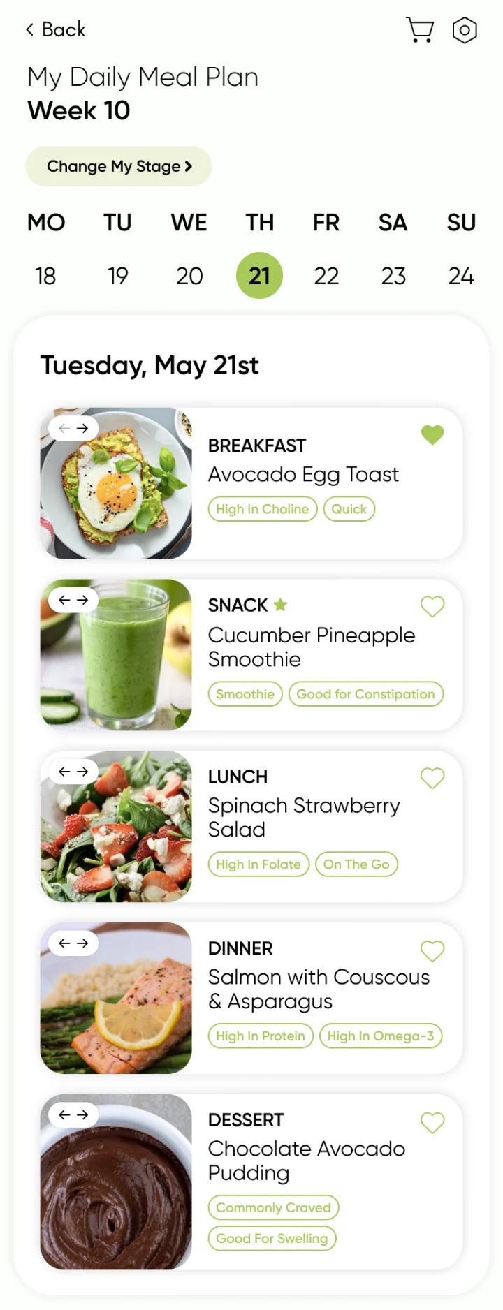
Rejected daily meal plan design: a small left-and-right arrow pill on each meal photo.
RejectedArrow pill on the photoIt felt like a slider with more dishes to browse. It wasn’t clear it swapped this breakfast, lunch or dinner for another.
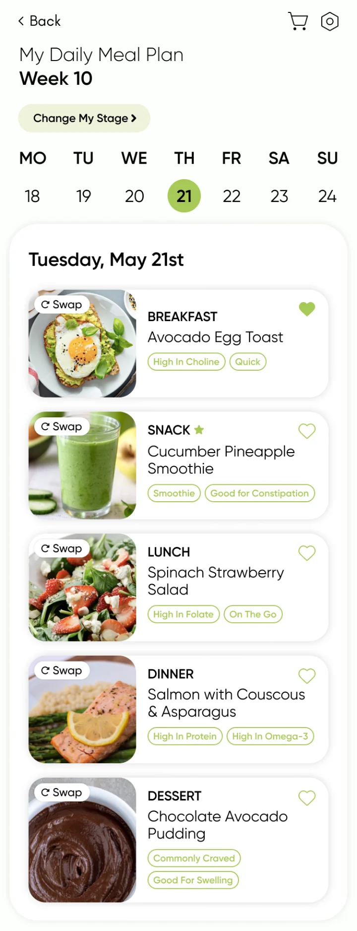
Earlier daily meal plan design: a Swap pill with a rotate icon on each meal photo.
Refined“Swap” pillIt worked: the rotate icon read as a new dish for the same meal. But the label was too small to read, and a larger one would have covered the food photo.
Shipped daily meal plan: each meal photo carries a rotate icon to swap the meal and a calendar icon to reschedule it.
ShippedIcon onlyThe same rotate icon without the text, so the photo stays clear.

Moving between weeks

Both designs were dropped once the plan followed the person’s current week: with the stage and week set at onboarding, jumping between weeks added a choice nobody needed.

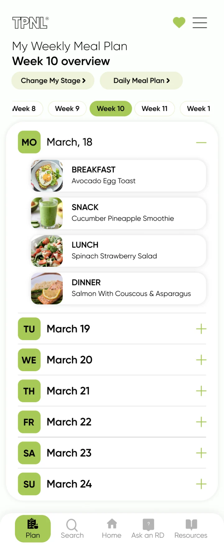
Rejected weekly meal plan design: a scrolling row of week chips, Week 8 to Week 12, with Week 10 selected.
RejectedWeek chipsA row of weeks to move between.
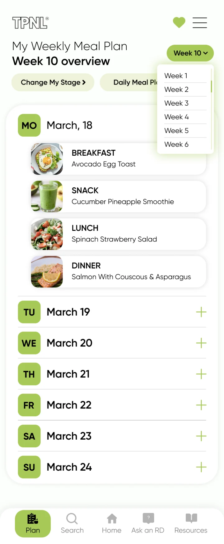
Rejected weekly meal plan design: a Week 10 dropdown open over the plan, listing Week 1 to Week 6.
RejectedWeek dropdownA menu of weeks to jump to.
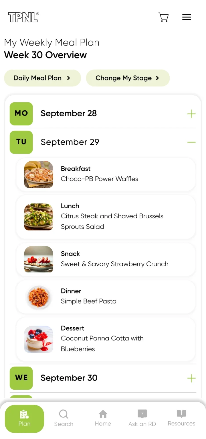
Shipped weekly meal plan: Week 30 Overview, with Daily Meal Plan and Change My Stage buttons and no week picker.
ShippedNo week pickerThe plan shows the current week.

07 · Design system

One set of styles and components behind every screen.

I built the design system in Figma: the color styles, text styles and components every screen is made from. The lime green palette, the Gilroy type and the icons were new in the rebuild.

Color styles

  • yellow-green#A7C957Primary
  • asparagus#EEF3DASecondary
  • laurel-green#B0C5A0Icon background
  • grey-light#F1F1F1For disabled fields

Text styles

All set in Gilroy. Size and line height in px. The “Ag” samples are set in this site’s font, at each style’s weight and at twice its size.

  • AgHeading 1Gilroy · 700 · 26/AutoMain heading
  • AgHeading 2Gilroy · 600 · 20/AutoSub heading
  • AgHeading 3Gilroy · 600 · 18/AutoSub heading
  • AgHeading 4Gilroy · 700 · 16/AutoSub heading
  • AgHeading 5Gilroy · 600 · 14/Auto
  • AgHeading 6Gilroy · 400 · 12/AutoSmall heading
  • AgBody largeGilroy · 400 · 16/22Large paragraph
  • AgBody smallGilroy · 400 · 14/22Regular paragraph
  • AgTagGilroy · 600 · 10/AutoUppercase

Components

Exported from Figma, grouped by purpose.

One-off designs used on a single screen, like the dietary preferences warning, stay as screens rather than components.

Buttons

Primary
Primary component
Secondary
Secondary component
Small
Small component

Filters

Recipe filter: meal
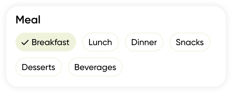
Recipe filter: meal component

The same chip component is used for dietary preferences and every other filter.

Icons

Form icons
Form icons component

Cards

Recipe card
Recipe card component
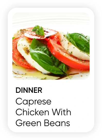
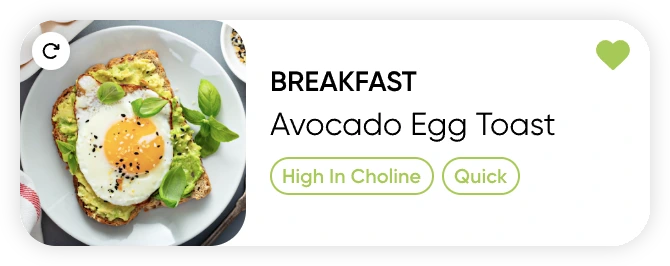
Meal card with swap and tags
Meal card with swap and tags component

Inputs

Input field
Input field component
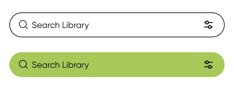
Search bar
Search bar component

Navigation

Bottom bar
Bottom bar component
Top bar and Home tabs
Top bar and Home tabs component
Side menu
Side menu component

08 · A day with the app

Plan once, then follow the day.

The screens hand off to each other: Today leads to the plan, the plan to recipes, a recipe to the grocery list, and the Library and Ask an RD sit one tap away. Screens from the live Android app.

Meals

5 screens
TPNL Today screen for Tuesday, 29 September, Week 30: the Nutrition Tip for Week 30; News of the Week reporting a raw milk cheese recall; today's meals, Choco-PB Power Waffles, Citrus Steak and Shaved Brussels Sprouts Salad, and Sweet & Savory Strawberry Crunch; and what's new in the app.
TodayThe date and week at the top, then week 30’s tip, News of the Week and today’s meals.
My Daily Meal Plan for Week 30, Tuesday 29 September: breakfast, Choco-PB Power Waffles; lunch, Citrus Steak and Shaved Brussels Sprouts Salad; snack, Sweet & Savory Strawberry Crunch; dinner, Simple Beef Pasta; dessert, Coconut Panna Cotta with Blueberries. Every meal has swap and reschedule controls.
Daily meal planEvery meal can be swapped or rescheduled.
My Weekly Meal Plan, Week 30 Overview, with Tuesday 29 September expanded to the same five meals as the daily plan, and the other days collapsed.
Weekly meal planThe week opens one day at a time.
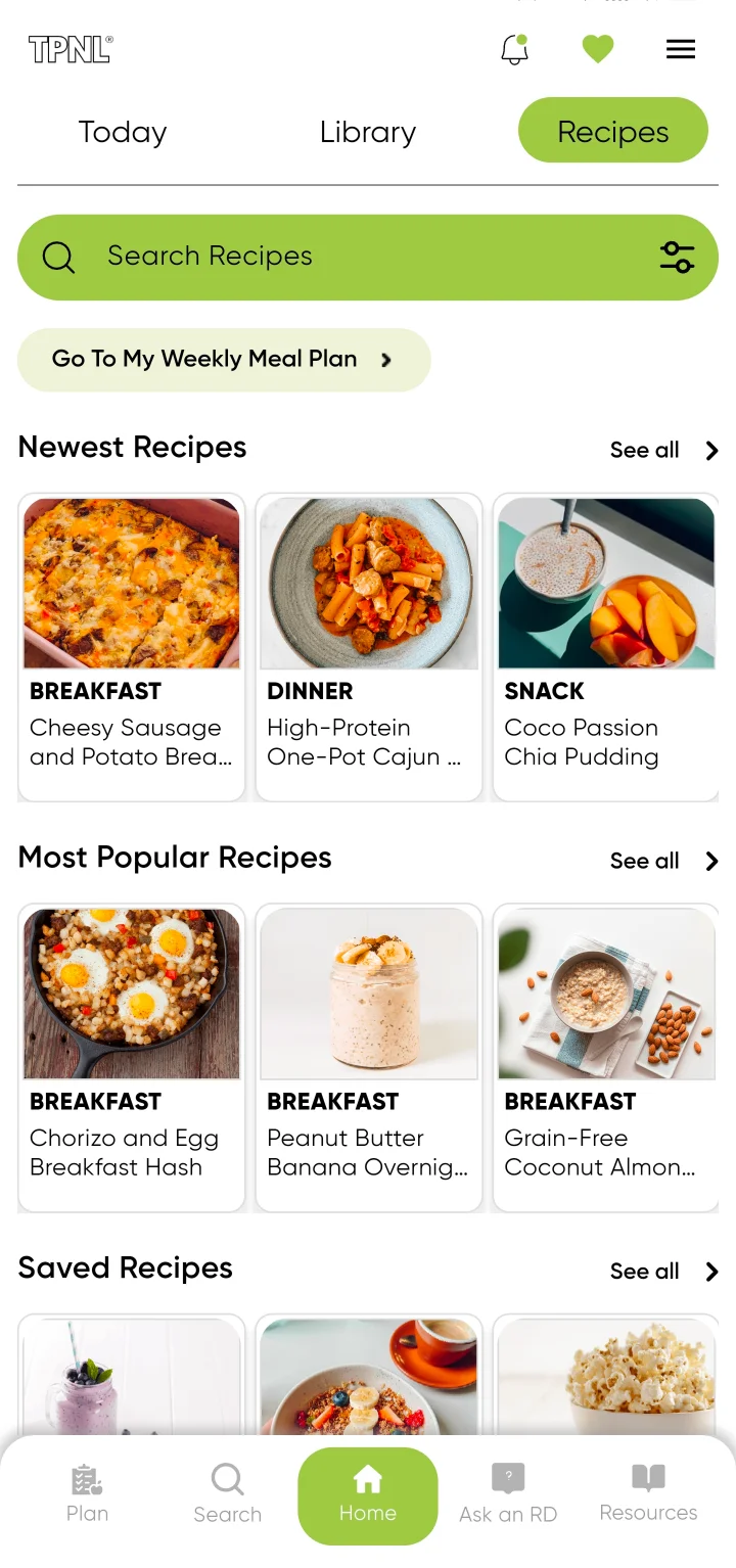
Recipes tab: a recipe search with filters, a link to the weekly meal plan, and rows of newest, most popular and saved recipes.
RecipesNewest, most popular and saved, with the weekly plan one tap away.
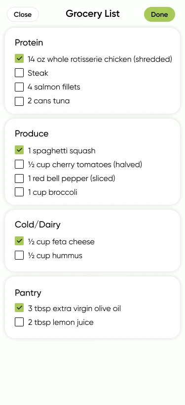
Grocery List, as designed: items grouped into Protein, Produce, Cold/Dairy and Pantry, including the ingredients of the Mediterranean Spaghetti Squash Casserole, each with a checkbox and some already checked; Close and Done buttons.
Grocery list · my designGrouped by food type, with items checked off as you shop. The live version was later changed by the team.

Learning

5 screens
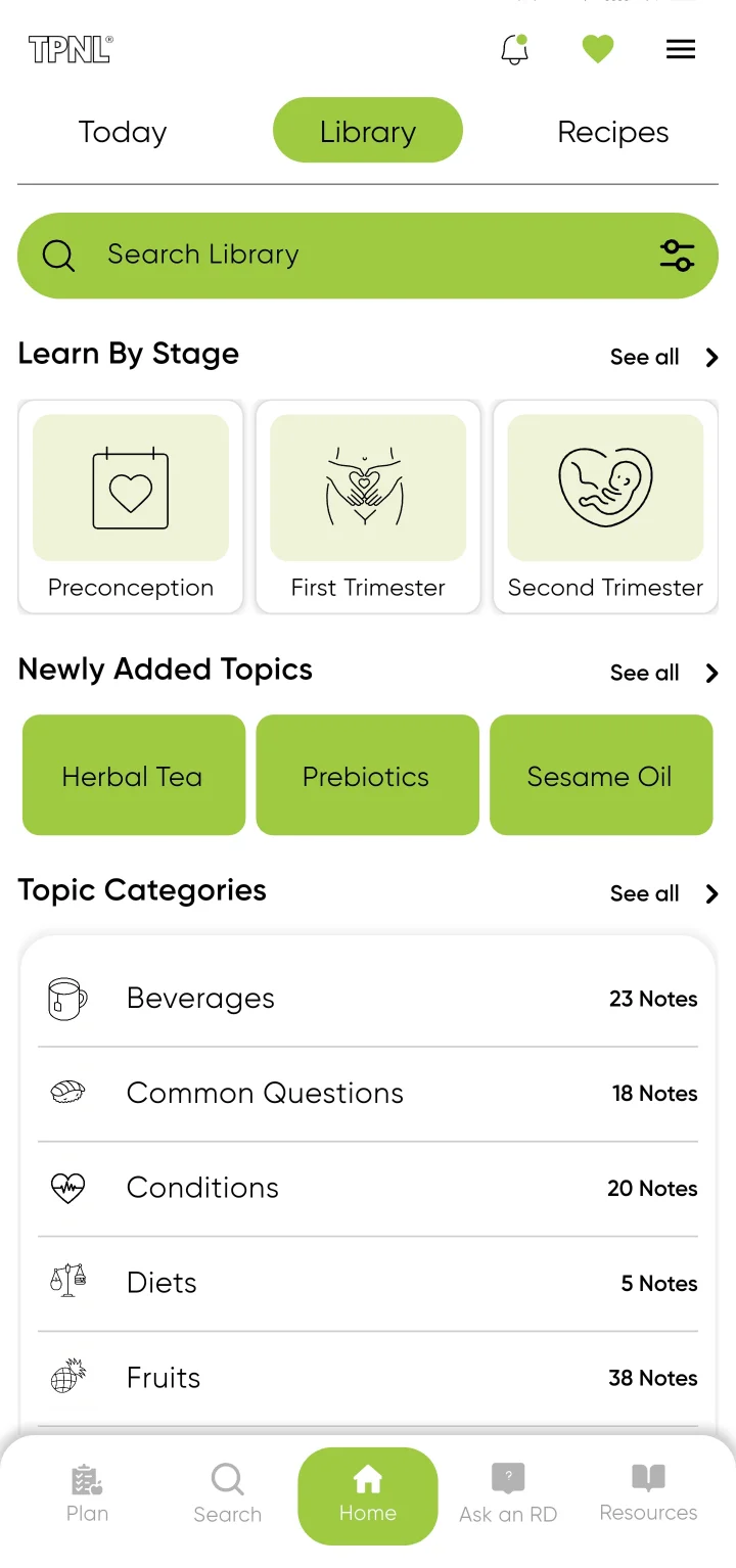
Library tab: Learn By Stage with Preconception, First Trimester and Second Trimester; newly added topics; and topic categories with their note counts.
LibraryLearn by Stage first, then new topics and categories.
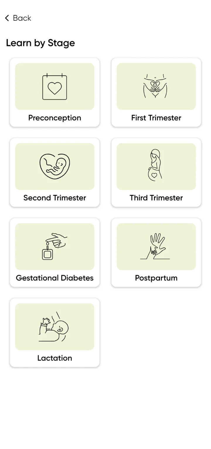
Learn by Stage: seven stage cards, Preconception, First Trimester, Second Trimester, Third Trimester, Gestational Diabetes, Postpartum and Lactation, each with a line illustration.
Learn by StageSeven stages, from preconception to lactation, including gestational diabetes.
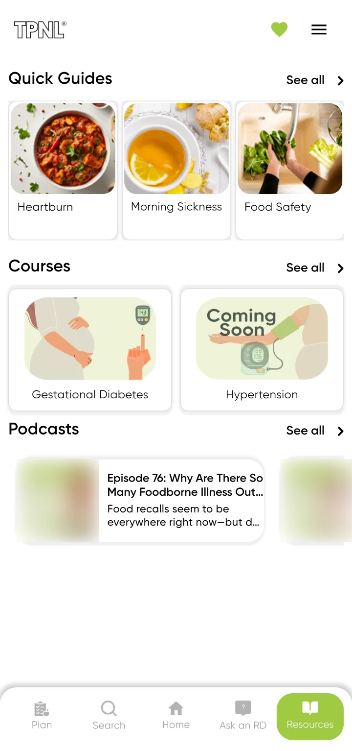
Resources: Quick Guides for heartburn, morning sickness and food safety; courses on gestational diabetes and hypertension; and podcasts, with the host’s photo blurred.
ResourcesQuick Guides, Courses and Podcasts together.
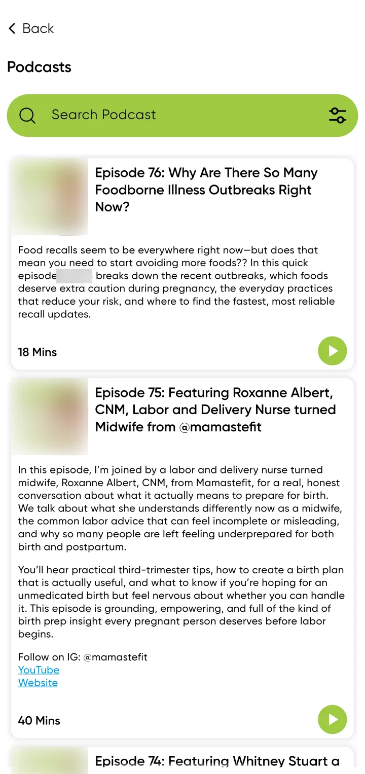
Podcasts: a podcast search, and episodes with artwork, a summary, their length and a play button. The host’s photo and name are blurred.
PodcastsEach episode with a summary, its length and a play button.
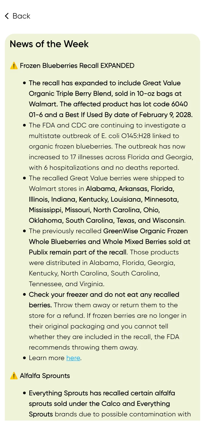
News of the Week: an expanded frozen blueberries recall, with affected products, where they were sold, what to do and a link to learn more; then an alfalfa sprouts recall.
News of the WeekFood recalls, with what to do next and where to learn more.

09 · Launched

Live on iOS and Android.

The redesign shipped as version 3.0. Here is what shipped, and how it was received.

put my tears and frantic Google searches to rest

App Store review · 5 September 2025
A week after launch.
Released
Version 3.0 · 28 August 2025On the App Store. The release notes describe the redesign and list its new features.
Rating
4.6 overall from 215 ratingsUS App Store, September 2026.
Available on
iOS and Android

One early review, a week after launch, names the problem the redesign set out to solve: the ingredient-by-ingredient Googling in 01.

10 · What I learned

Two things I took from it.

  • Information architecture is about timing, not just categories

    The question wasn’t only where content belonged. It was when someone needed it, and what decision they were making. Hundreds of recipes, notes, guides, courses and podcasts don’t become useful by being categorised. Starting from the stage and week gives people a more relevant place to begin.

  • Personalisation needs boundaries

    The product has to help without pretending to replace individual professional advice. Here that meant a warning when dietary preferences stack up, and a clear line between community discussion, expert content and nutrition services, so it is visible where the app’s advice ends.

11 · How I’d measure success

Four measures for stage-first navigation.

  • 01 · Stage-first navigationDoes starting from the pregnancy stage help people find relevant content with less effort than browsing the library?
  • 02 · Recipe actionsDo people understand and use Add to Grocery and Add to Meal Plan when they are viewing a recipe?
  • 03 · Contextual searchWhich combination of stage, meal type and symptoms actually supports discovery?
  • 04 · Personalisation guardrailsDoes the warning help people understand the consequence of choosing too many preferences, without creating unnecessary friction?